Understanding Viewport in Web Development
Viewport is a crucial concept in web development that determines how a webpage is displayed on different devices and screen sizes. In simple terms, it defines the visible area of a webpage within a browser window. Let's delve deeper into understanding viewport, its importance, and how it affects web design and development.
What is Viewport?
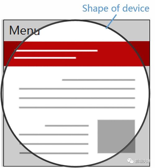
In web development, the term "viewport" refers to the visible area of a webpage within the browser window. It varies depending on the device and screen size. Initially, when web browsing was limited to desktop computers with standard screen resolutions, the viewport was essentially the same as the browser window.
However, with the proliferation of mobile devices such as smartphones and tablets, each with its own screen size and resolution, the concept of viewport became more complex. Developers needed to ensure that web content is displayed properly across various devices, regardless of their screen dimensions.
Types of Viewport
There are two main types of viewports:
1.
Layout Viewport:
This is the virtual area in which the web page layout is rendered. It usually corresponds to the width and height of the device screen.2.
Visual Viewport:
This represents the part of the layout viewport that is currently visible within the browser window. It can be smaller than the layout viewport if the webpage is zoomed in or scrolled.Understanding these viewports is essential for creating responsive and mobilefriendly web designs.
Importance of Viewport Meta Tag
To optimize webpages for different devices, developers often use the viewport meta tag in the HTML head section. This meta tag allows developers to control the layout viewport's behavior and ensure that the webpage renders correctly on various devices.
Here's an example of a viewport meta tag:
```html
```
Let's break down the attributes:
width=devicewidth:
This sets the width of the layout viewport to the device's screen width. It ensures that the webpage content adjusts to fit the screen size.
initialscale=1.0:
This sets the initial zoom level when the webpage is first loaded. A value of 1.0 ensures that the webpage appears at its default size without any zooming.Viewport Units in CSS
In addition to the viewport meta tag, CSS offers a set of viewportrelative units that allow developers to size elements based on the viewport dimensions. These units include:
vw (viewport width):
Represents 1% of the width of the viewport.
vh (viewport height):
Represents 1% of the height of the viewport.
vmin:
Represents 1% of the minimum of the viewport's height and width.
vmax:
Represents 1% of the maximum of the viewport's height and width.Using viewport units, developers can create fluid and responsive layouts that adapt seamlessly to different screen sizes.
Best Practices for Viewport Optimization
To ensure optimal viewport behavior and improve the user experience across devices, consider the following best practices:
1.
Use Responsive Design:
Design webpages that adapt fluidly to various screen sizes using CSS media queries and flexible layouts.2.
Set the Viewport Meta Tag:
Always include the viewport meta tag in your HTML to control the layout viewport's behavior.3.
Test Across Devices:
Test your website on different devices and screen sizes to ensure consistent rendering and functionality.4.
Optimize Performance:
Keep the webpage lightweight and optimize assets such as images and scripts to improve loading times, especially on mobile devices.5.
Accessibility:
Ensure that the content remains accessible and readable, even on smaller screens, by using appropriate font sizes and spacing.Conclusion
Viewport is a fundamental aspect of web development that plays a critical role in creating responsive and mobilefriendly websites. By understanding how viewports work and implementing best practices for viewport optimization, developers can ensure that their webpages look and perform well across a diverse range of devices.
版权声明
本文仅代表作者观点,不代表百度立场。
本文系作者授权百度百家发表,未经许可,不得转载。


